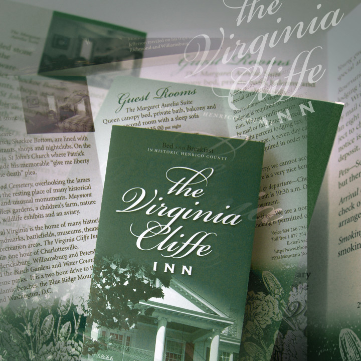
This is one in a series of what I call “design palettes”: the mix of basic ingredients—typefaces, photographs, illustrations, and color schemes—that, in one designer’s opinion (mine), represent a distinctive mood or style.
My hope, as with most of my writings, is to get beyond theory to reveal some of the fundamental elements and principles that make a specific design work. Though concepts such as white space, balance, and contrast have value, I will focus here on some of the hundreds of little informational and style decisions that go into real-world layouts. The elements that make people hear what you say and feel what you show.
What is a design palette?
THIS PALETTE centers on elements of design from the early years of commercial design and printing in the 1700s and 1800s—ornate script, woodblock engraving, and limited, muted color (figure 1). I chose it to kick off this series because I want to jump right in and begin to challenge your thinking.
The challenge? To resist the temptation to make everything look new. If you’re online all the time it’s easy to lose perspective—though we regularly see some of the best, most exciting design being done today, it is often uncharacteristically modern or reflects the style of the moment. The challenge is to match the presentation to the subject, not to the medium.
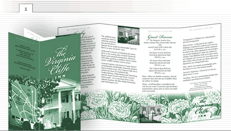
A Graceful Palette is used to market a graceful product—The Virginia Cliffe Inn, a stately bed and breakfast in my neck of the woods. Obviously, it is significantly different than the palette I’d use to design a website for a tech startup or a t-shirt for a bike team. The elegant typefaces and muted colors are more suited to a client such as a fine furniture store, a law firm, or a custom home builder.
The Typefaces
The palette features a combination of three classic-looking typefaces. The title, The Virginia Cliffe, is set in a “display” face called Bickham Script (figure 2). A display face is one designed especially for sizes larger than standard body text. Richard Lipton, a current-day type master, rendered it using the style of 18th-century engraver George Bickham.
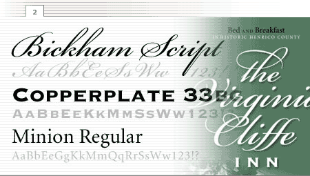
To my way of thinking, the display typeface is the show’s headliner and the other faces are the backup singers—their job is to enhance the headliner’s voice, not to overpower it. The word INN is set in Copperplate 33BC and the body text is set in the serif face Minion.
For subheads and labels (figure 3), try using the body text face in all caps with one or two spaces between letters.
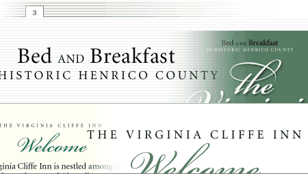
Sources: Bickham Script, Copperplate 33BC, Minion are published by Adobe Systems.
The Illustrations
In the 1700s and 1800s, when you wanted to illustrate print materials, you used a wood or metal engraving. Many artists of the day were able to create near-photographic images that offered an idyllic picture of people, places, and things. Thankfully, many have been preserved in the collections of modern-day clip art companies—in both book and electronic form (figure 4).
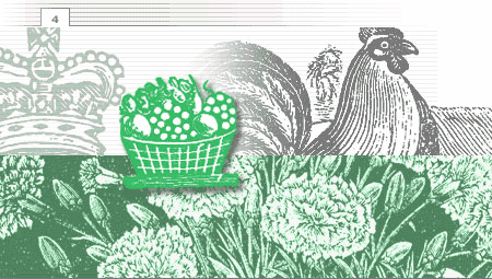
Dover Publications has been publishing books of antique illustrations since the 1940s. One of the real treasures is from their Dover Pictorial Archive Series—1800 Woodcuts by Thomas Bewick and His School, edited by Blanche Cirker. It includes 250 pages of intricate images by England’s foremost wood engraver divided into chapters on natural history, people, business and trades, and the graphic arts.
Unlike most copyrighted books, some Dover publications permit you to scan and reproduce up to ten illustrations from the book for any one project free and without special permission.
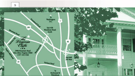
Note how using the same colors and typefaces in this map (figure 5) conform it to the style of the brochure. A strong palette allows you to integrate a variety of elements without disrupting the mood.
Sources: 1800 Woodcuts by Thomas Bewick and His School published by Dover Publications. Now available through Dover Pictura.
The Photographs
There is, of course, a huge selection of great stock and royalty-free photography available today, more than ever before. Generic images are convenient, easy-to-use and, in most cases, fairly inexpensive. But this type of project requires custom photography (figure 6).
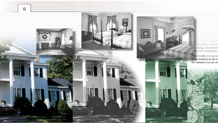
Most clients don’t fancy paying a professional photographer $800 or $1000 a day to shoot their product or location, but nothing can substitute for showing actual people, places, and products.
These images, I confess, are snapshots taken by the client. I removed the color, did a little enhancement in Photoshop, and applied a duotone Pantone ink color. Photoshop and other editing programs allow you to take marginal images and make them usable. In fact, the ease of editing allows me to use my own digital camera to grab simple shots here and there that I would once have paid a professional to take.
I remember reading a web design article suggesting that you NOT include pictures of people on your site—the writer reasoned that no one was interested. To me, nothing could be further from the truth. In fact, I believe one foundational piece missing from many websites is that personal connection. If I’m visiting your site for the first time and don’t know anything about you, I want to see the people behind the screens. It not only softens the depersonalization of the digital medium, it gives me a better idea of who I’m dealing with and increases my sense of security.
Even more important is that you show your product or the result of using it. Obviously, if you are selling handmade furniture, you’re going to show it—but even if you’re selling accounting services, I urge you to show it. How? Commission a photograph the package of information you send when people inquire about your business. Show the old photograph of the founder in his 1920s office. Make your materials personal and you have a far better chance of building the kind of relationship people need to feel comfortable enough to work with you.
Temper all that, of course, with a healthy appreciation for your own security. Be sure not to show images, especially in the anonymous online world, that might somehow compromise your organizational or personal security. Assume that your competitors, and perhaps those who might in some way exploit you, are watching.
Sources: Need a professional photographer? Ask around. Some specialize in staged studio shots of people and things, some in location shots, others in aerial photography, and so on. I use Dennis McWaters in Richmond, Virginia—a great all-round professional. If you can’t find a good photographer locally, and you have a product that can be shipped to his studio, I encourage you to call for his sample sheet and prices: 804-644-0015.
The Colors
Why use two colors (black and green) when you have thousands of others to choose from? Because this basic two-color palette fits the mood of the design. It wasn’t until the late 1800s that full-color printing became a reality. Although your audience may not know the history of it, they have likely seen enough material from the era to instinctively accept the limitation.
There are two basic ways to reproduce color on a conventional printing press: using process colors or solid colors. The process method typically employs four process colors—cyan, magenta, yellow, and black (CMYK). The great majority of full-color materials you see—magazines, direct mail, and packaging—are printed using the four-color process. Screened combinations of these four inks can reproduce a wide spectrum of colors.
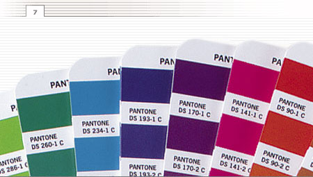
But for this project, I used a less expensive alternative—two solid colors: black and PANTONE 349U. The PANTONE color matching system is the de facto standard for commercial printers, with over 1,000 colors from which to choose. You simply specify an ink color using a PANTONE formula guide (figure 7)—and the printer buys a container of ink mixed to match that specific formula. It is the best, least-expensive way to get a near-perfect color match.
Virtually all of the advanced publishing tools—InDesign, QuarkXpress, Photoshop, Illustrator, Corel, and so on—allow you to specify PANTONE colors.
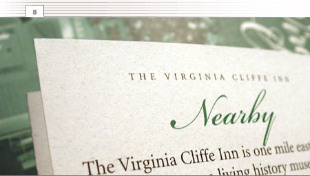
Finally, don’t overlook the impact of paper. It is often one of the least expensive ways to add color and texture to your project. Look closely (figure 8) and you’ll see the fibers embedded in the cream-colored sheet I chose. It adds a sense of elegance and yet another level of tactile and visual interest to the final printed piece.
