Some design palettes ease the reader into the subject with a combination of graceful type, muted color, and subtle imagery. The Assertive Palette is a bit more obvious. This combination of typefaces, colors, and illustrations is meant to strip away distractions and use visual contrast to highlight the key messages.
What is a design palette?
A design palette is a the mix of basic ingredients—typefaces, illustrations, and a color scheme–that, in one designer’s opinion (the author’s), represents a distinctive mood or style. I created this one some time back but I think the thinking, if not the design itself, stands up pretty well.
The Typefaces
The primary typeface is Griffith Gothic—a clean, readable face with quiet strength—by that, I mean it does the job beautifully without dominating everything around it.
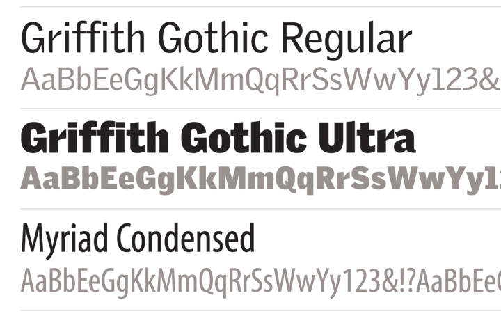
What makes it unique? The “G,” the “r,” and the “a” of Griffith Gothic Ultra show off the attributes that make this typeface so distinctive—in particular, the sharp edges and the interesting transitions of thick to thin.
The body text is set in Myriad Condensed—a simple, elegant sans serif face that, at this size and weight, remains neutral—when you’re packing a lot of information into a small space neutral is good.
Variations in the color, size, spacing, and capitalization of the type are an important part of what is happening here. Mixing it up adds emphasis where it is needed and interest to the layout.
WHERE TO GET IT:
Griffith Gothic from Frere-Jones Type at TypeNetwork.com
Myriad Pro from Adobe Type at MyFonts.com…
To create a simple “text logo,” type the words in Adobe Illustrator, convert it to outlines, then scale them to the same width. Overlay them on a square background and use colors from the palette to group the parts.

The Colors
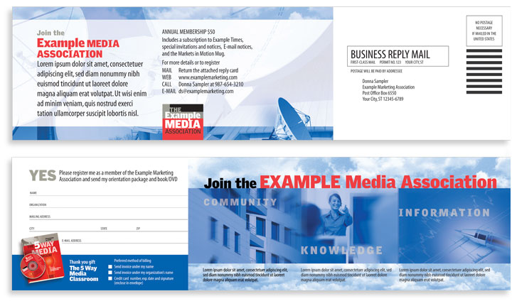
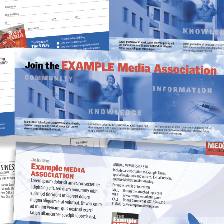
A full-color version of this piece would have an entirely different look and feel. Limiting the use of color, quiets the visual noise and focuses attention on the straightforward concepts the photographs are meant to illustrate: for “community”—the organization’s headquarters, for “knowledge”–a trainer in a classroom, and for “information”—a picture of statistical data.
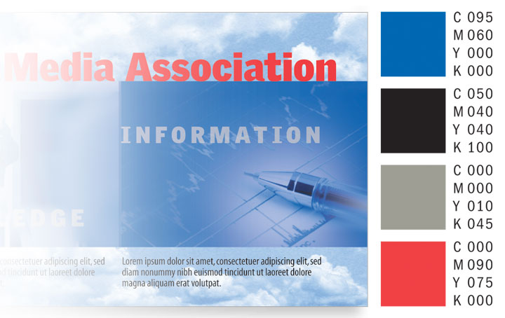
Color is also a great way to organize information. Squint your eyes at the layout and you’ll see that what pops out is the red—the headlines, the logo, and the incentive—all the primary points we chose to emphasize.
The Illustrations
Layering images and color and adjusting layer opacity so you can see one layer through another makes the images more metaphorical than literal—more like magazine illustrations than newspaper photographs.
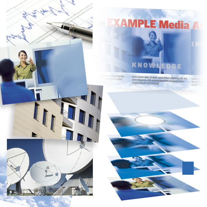 That use of transparency combined with the sky and clouds backgrounds helps to create a sense of airiness and lightness. The horizontal stripe of images across the front and back panels keeps the eye moving.
WHERE TO GET IT: Trainer from “Conferences & Training” by Stockbyte from fotosearch.com; light bulb by Comstock from fotosearch.com; statistical data, building, satellite dishes from istockphoto.com
To recreate the illustrations:
1. In Photoshop: Create the blue in the Color Picker; choose Image > Adjustments > Hue/Saturation; click Colorize and increase the Saturation for a similar effect
2. Duplicate that layer (above), choose Select > All; choose Filter > Blur > Radial Blur >; select Amount: 75, Method: Zoom, Quality: Good 3. On that same layer, circle (select) the primary subject of the image with the Elliptical Marque Tool; choose Select > Feather; set Feather Radius to 75 pixels and choose Edit > Cut 4. Create a third layer (above), solid blue and reduce the Layer Opacity for a similar effect
The Layout
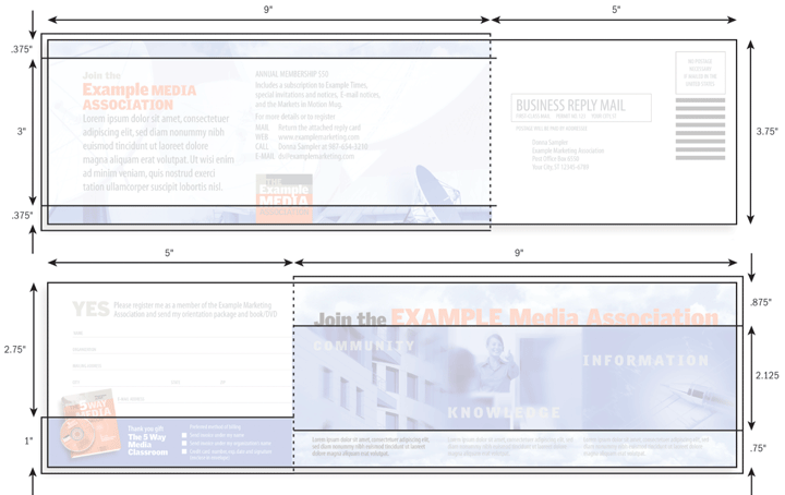
This piece folds down to 9 by 3.75 inches to fit a #10 business envelope. You mail it along with a cover letter and invite the reader to fill in the Business Reply Card, detach it, and mail it back to you postpaid.
The Details
Whether a particular palette works or not is dependent, in large part, on attention to detail. Subtle changes in size and color, the alignment of individual elements, the choice of images, and so on, is what makes good—great.
Notice how the design of the book and disc incorporates a similar palette? Extracting parts and pieces of one palette to create another results in two elements that are compatible but distinctive.

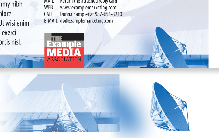
Need to make your image more assertive? Find a part or portion of the photograph and bring it out front. On side two of the mailer, the smallest dish was outlined, copied, overlayed, and set off the surface with a drop shadow.
Posted in JUNE 2021 / Chuck Green is the principal of Logic Arts, a design and marketing firm, a contributor to numerous magazines and websites, and the author of books published by Random House, Peachpit Press, and Rockport Publishers. All rights reserved. Copyright 2007-2021 Chuck Green/Logic Arts Corporation. Contact.



Thoughts?