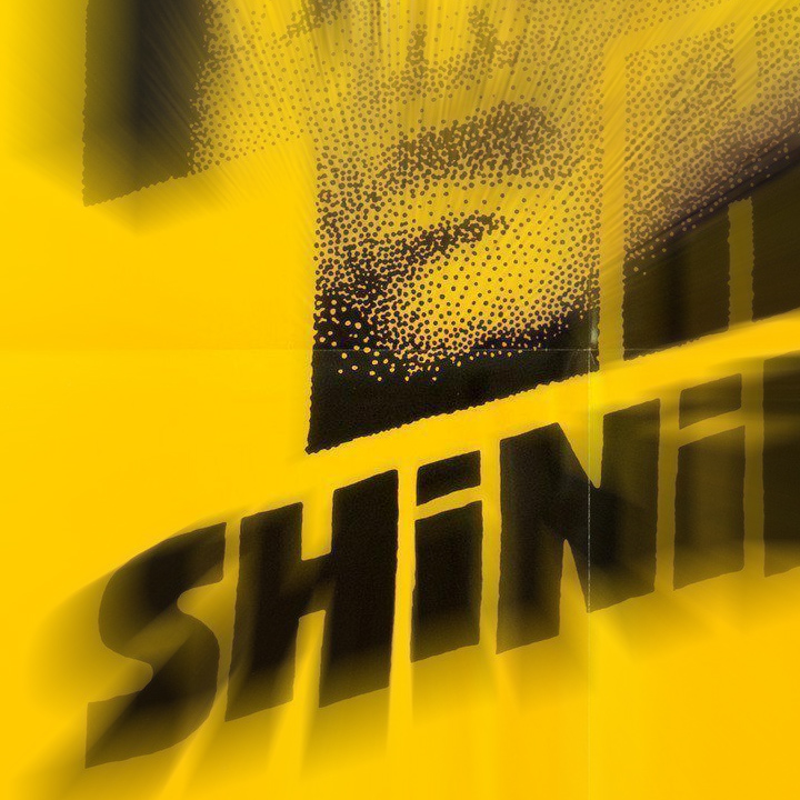
If you love witnessing the creative process, don’t miss this classic post about Saul Bass’ design of the poster for Stanley Kubrick’s “The Shining”. A letter from Bass to Kubrick, in part, reads:
Dear Stanley: Here are the five designs which surfaced out of the work done since I returned. I am excited about all of them, and I could give you many reasons why I think they would be strong and effective identifiers for the film. But the one I think is strongest is No. 1. It’s provocative, scary and emotional. It has size, and promises a picture I haven’t seen before.SAUL BASS
The designs and correspondence…
Film of Jack Nicholson preparing for “The Shining”…
Saul Bass on Art of the Title…
Thanks to Bob Staake for pointing us to it.
Posted in APRIL 2019 / Chuck Green is the principal of Logic Arts, a design and marketing firm, a contributor to numerous magazines and websites, and the author of books published by Random House, Peachpit Press, and Rockport Publishers. Copyright 2007-2019 Chuck Green/Logic Arts Corporation. Contact.


Thoughts?