Designer Milton Glaser famously said, “I move things around until they look right.” Every designer knows what he means. So what is that magic? How is it one person is so adept at micro decision-making about elements like shape and color and space—and the next person isn’t?
I think of it as informed awareness. The skill of being aware about what the potential changes that could be and being informed enough to know which of the changes will and won’t work. As I like to think, design is opinion—but it is also about understanding current styles, trends, and fundamentals such as balance, weight, juxtaposition, and so on.
Recently, I saw a just-for-fun logo makeover designer and illustrator Von Glitschka posted for his favorite baseball team, the Baltimore Orioles.
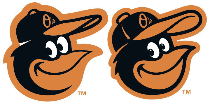
I asked him if he would mind if I posted my thoughts about it and he was kind enough to provide some artwork. I want to share it with you because I think it is an excellent example of design nuance. The very subtle choices that can turn something good into something great.
Here’s what I’m seeing:
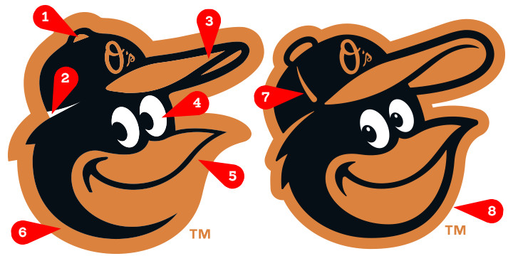
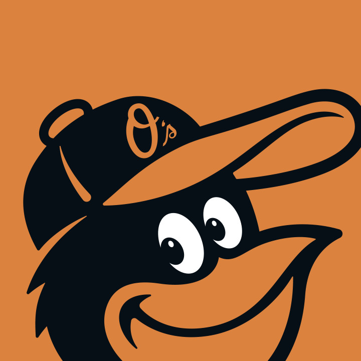
1. Step back from the original (above, left) and the button on the top of the cap looks like a bump. If you’re going to include a shape in a logo, it’s got to serve a significant purpose. The new version of the button looks like a button even at a small size.
2. I’m not certain what the white strip is meant to signify, but on the new version, it is now clear that it is meant to draw the distinction between the cap and the head. The addition of a second feather just below the cap, to me, adds a little visual complexity that better matches the rest of the logo.
3. The bill of the cap is huge improvement. The cap on the original seems a little small in proportion to the head and doesn’t give you a sense that the it is wrapped around the head—the makeover solves both problems. The size and weight of the hat is, to me, one of the most significant improvements.
4. So too are the eyes. Something as simple as altering the size of the right eye (reducing the size) and adding whites to the eyes adds a whole new sense of the bird’s personality.
5. Another significant improvement is the bold line around the bottom of the bill. It really solidifies the logo and adds much needed visual balance with the heavy, complex top-left area.
6. It’s funny how something as simple as the weight of the border can have such a positive impact. To my eye, by comparison to the makeover, the before bird is getting lost in the background.
7. The seam in the cap is a nice addition—it balances the complexity of the image and is bold enough that it doesn’t get lost.
8. And one final, very important adjustment: the makeover is rotated counter-clockwise slightly to remove the sense (with the original) that it is about to tip over.
Von Glitschka is a master of this type of nuance. Whether you’re starting from scratch or, as in this case, working from a base of existing information, I think what we know as talent is, in large part, one’s ability to make these types of decisions.
This image further demonstrates the differences.
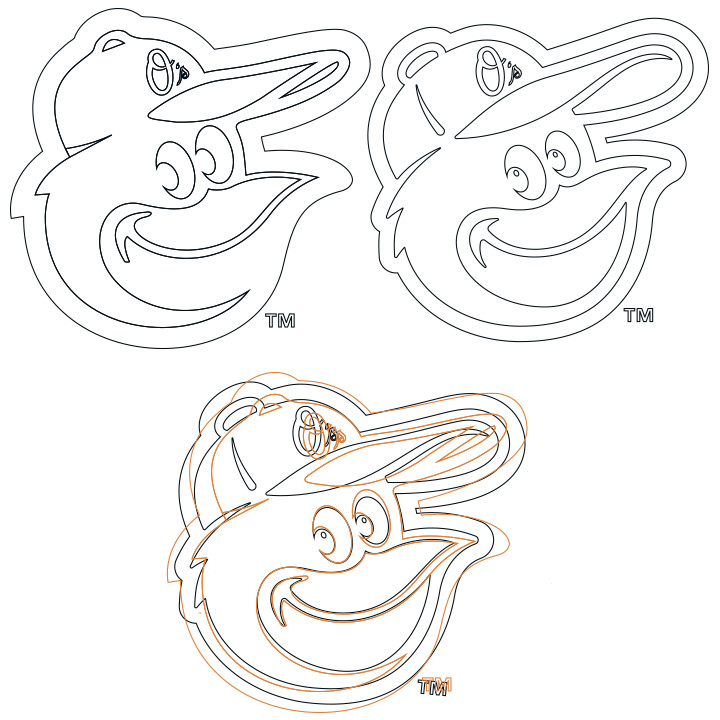
Great stuff yes? If I was the client, the only remaining piece I’d ask Von to tackle is the “O’s” signature. I’d like to see it simplified, smoothed, and bolded just slightly. Haha... but then, design is opinion.
So what other nuances do you see?
Here’s a history of the Cartoon Bird and other Baltimore Orioles logos...

Thoughts?