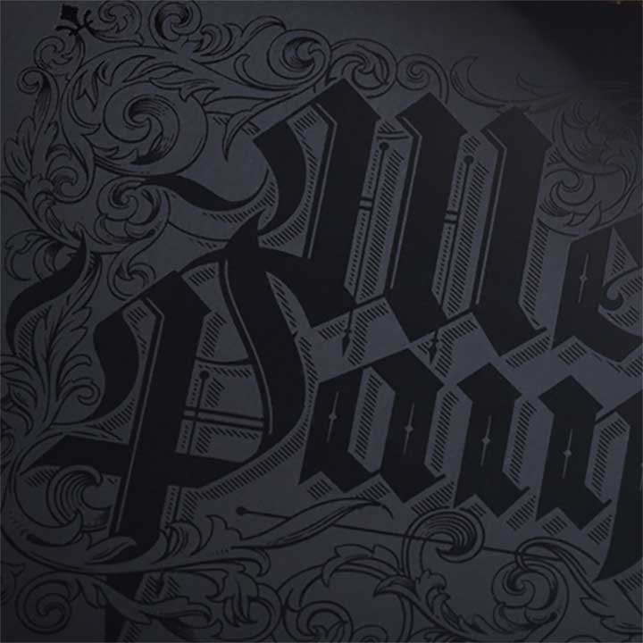
Much of Tom Lane’s lettering and design has a turn-of-the-century feel to it. He does a kind of hybrid of illustration and lettering. I like the way he uses these well-worn principles in new ways.
Lane also designed the Archangels Playing Card deck for Theory 11…


Thoughts?