Typography is a weird bird. When I look at a typeface, I almost instantaneously decide if it’s good or bad (in my mind). A characters of a good typeface are not only interesting in themselves, more importantly, they are interesting in the way they interact with each other. Though it’s clearly contrived, that realization seems very natural to me. That make sense?
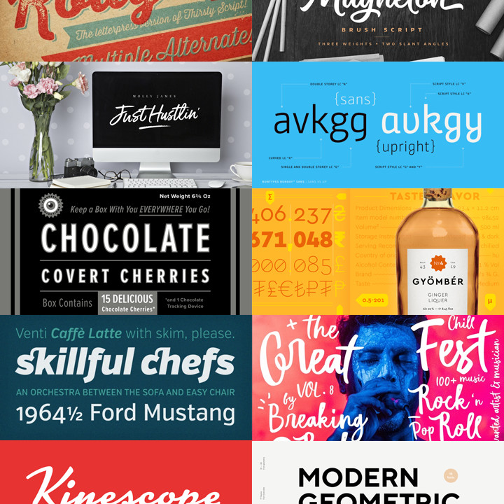
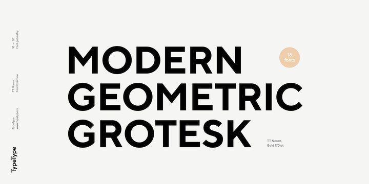
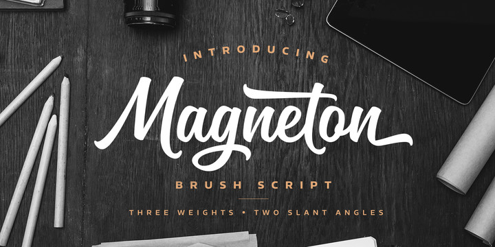
In any case, I thought I’d look around on MyFonts.com to see what strikes my fancy today. I grabbed a few new typefaces and several older one’s that, to me, are very well designed. What do you think?
Follow one of the links and purchase a typeface and I get a small commission (though I didn’t choose these 10 for any reason other than their impresssion).
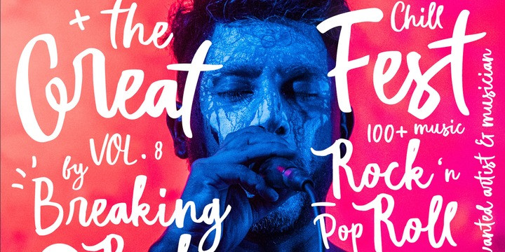
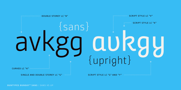
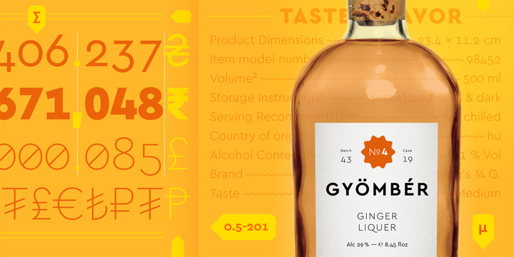
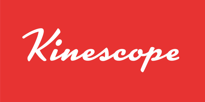
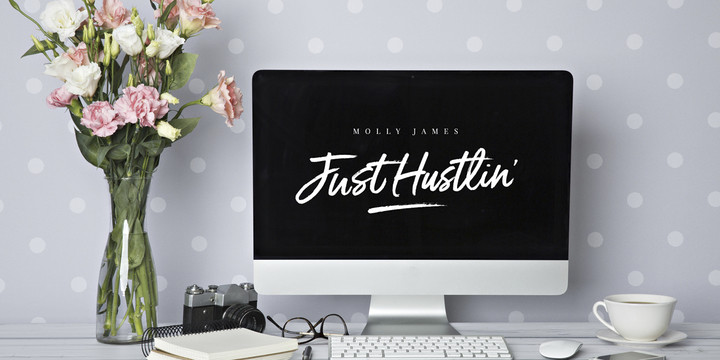
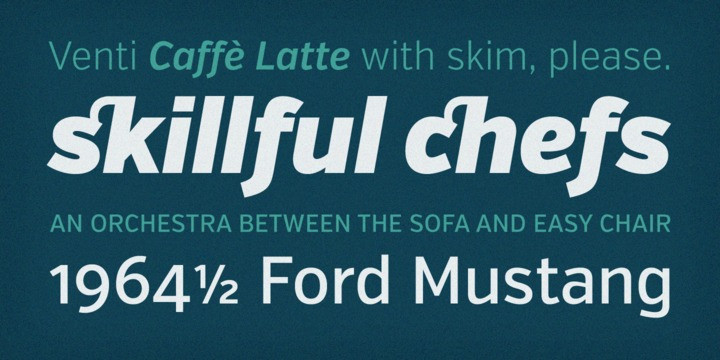
Verb from Yellow Design Studio…
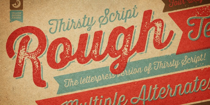
Thirsty Rough from Yellow Design Studio…
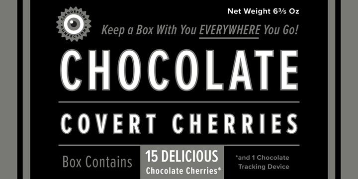
Proxima Nova by Mark Simonson…
Posted in JULY 2017 / Chuck Green is the principal of Logic Arts, a design and marketing firm, a contributor to numerous magazines and websites, and the author of books published by Random House, Peachpit Press, and Rockport Publishers. Contact.

Thoughts?