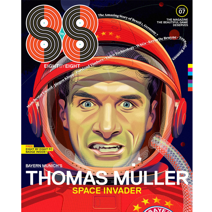
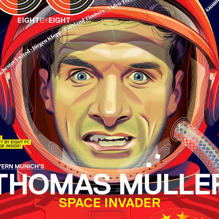
What drew me to Nigel Buchanan’s illustrations when I first saw them a decade ago, was how adeptly he tells a story. They are, at once, striking, unusual, and technically interesting. But he really got me wondering about the tools he uses to create his illustrations—it looks like he uses an old-fashioned mechanical airbrush but they also have a distinctive digital quality about them. So I asked.
He told me at the time that he primarily uses Adobe Photoshop—at times creating images with as many as 100 layers. If the illustration includes elements such as typography or mechanical-looking items he explained he might also incorporate Adobe Illustrator. “I used a (mechanical) airbrush years ago,” Buchanan says, “and the computer technique I use now employs the same principles; paths as masks and a pressure sensitive stylus.”
This is a recent snapshot of his process…
What makes a successful illustration?
Here’s the takeaway for young illustrators: his emphasis is on creating a clear concept and a beautiful drawing to work from. “It is too easy to rely on computer programs (and filters or trace tools) to make an illustration look acceptable. What many illustrators forget is that it’s the strength of the image and the idea behind it that makes an illustration successful.”
As an art director, I can certainly attest to that. Lots of illustrators get so hung up in creating a distinctive look that they lose track of the importance of the ideas they are illustrating. In addition to style, there’s great beauty in concepts and nuance. Look at the work of any great illustrator and you’ll find both.
A few examples of Nigel Buchanan’s work…
Example 1…
Example 2…
Example 3…
Since I first pointed you to him, much of Nigel Buchanan’s work has turned toward portraiture. I really love the complex, detailed shapes and his unusual use of color—some really stunning stuff…

Example 4…
Example 5…
Example 6…
An excellent interview with the artist…
From American Illustration and American Photography (AI-AP)…
Buchanan’s website…
His Twitter feed…
He recently began collaborating with Yves Stening on a series of children’s books titled Dinner Detectives…
He has also illustrated some app-based stories…
Including this iPad version of The Jungle Book…
Image used with permission: Illustration by Nigel Buchanan; Art Direction by Robert Priest of Priest and Grace, New York…
Posted in SEPTEMBER 2019 / Chuck Green is the principal of Logic Arts, a design and marketing firm, a contributor to numerous magazines and websites, and the author of books published by Random House, Peachpit Press, and Rockport Publishers. All rights reserved. Copyright 2007-2019 Chuck Green/Logic Arts Corporation. Contact.


Slick, the work — but delicate, the sensibilities. I’m not the perfected artist to the layered notion of airbrushed splendor. But, to your comment, the real sense of transparency in the imagery is the idea of the story — and that’s surely what I’m looking for. What’s the story, who’s telling it, what does it look like? Finally, who cares?
What is the story? And — how is it loved?
That story, beauty full in the telling, is where it’s at. Story, told: http://www.girvin.com/blog/?cat=8