If anyone ever asks you what branding is, show them this video…
Then show them this web page…
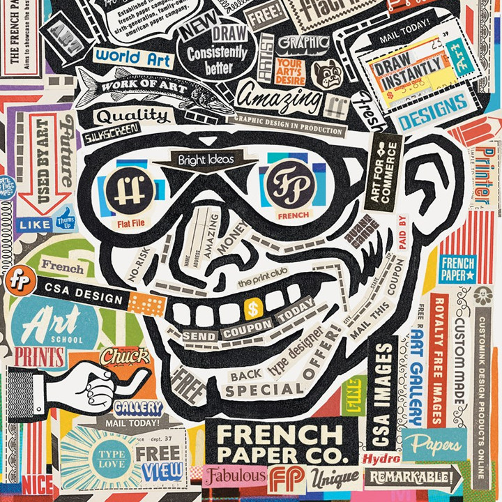
That’s what branding is—the extrusion of, in this case, a paper manufacturer with buildings and equipment and people and products, through a die that forms a uniquely shaped object that customers appreciate and understand and embrace for its product, its attitude, and its style.
That brand, in collaboration with Jerry French and the folks at French Papers, is the work of Charles S. Anderson Design Company in—here’s how they explain the relationship:
“Over the years, French’s outstanding papers have become synonymous with stand-out design, so it’s hard to believe that for the first 114 years of their existence, the closest they got to design was the local printer who produced their swatch books.
That all changed in the fall of 1985, when a young Charles S. Anderson’s search for a gritty, recycled newsprint-type paper in an overused sea of slick coated sheets led him to recycled French Speckletone. Little did he know he had not only found the perfect paper, but the perfect client as well.”
That’s so important—when the client is earnestly invested in the contribution of the designer (and vice-versa)—brands flourish.
But branding is just one chapter of this story.
I first ran into Charles Anderson when I was writing a book about clip art back in 1995 (Clip Art Crazy published by PeachPit Press). Even then, Anderson had compiled close to one million twentieth-century line art images that were being used on prominent projects for everyone from Turner Classic Movies and Levis to Nike and Paramount Pictures.
The story goes like this: Anderson inherited a substantial collection of original artwork from retired commercial artist Clyde Lewis (Lewis had spent his career producing advertising illustrations for matchbooks, menus, signage, and the like). And that became the jumping off point for a collection, that today, is one of the most unusual and lauded stock art libraries anywhere—one that is, to my mind, head-and-shoulders above the rest. As Anderson sees it, CSA Images is the antithesis of what you’d expect to find in a conventional collection—so much so that he refers to it as, “anti-stock.”
The illustrations and photographs come from every imaginable source: old books, magazines, catalogs, packaging, even cocktail napkins and matchbooks. Hundreds of others are original works by Anderson and his staff. What makes this collection distinctly different is that each illustration is selected on the merits of its content and style, and is then cleaned-up, simplified, embellished, and/or entirely redrawn to give it CSA stature.
To fully appreciate the value of the collection you need to see the mastery with which Charles S. Anderson Design Company, Anderson’s much acclaimed design studio, uses the images for real projects:
Or the poster design at the top of this page—one used to promote a lecture given by Anderson to students at Full Sail University (CSA Design).
This page displays the width and breadth of CSA Images…
The Charles S. Anderson Design Company website…
Don’t miss the French Paper store which features products and promotions produced using CSA Images…
Here’s a unique offer from French Paper—free use black and white images if project must be printed on French Paper (see the license).
And finally, an in-depth presentation by Anderson for the AIGA…
Posted in AUGUST 2017 / Chuck Green is the principal of Logic Arts, a design and marketing firm, a contributor to numerous magazines and websites, and the author of books published by Random House, Peachpit Press, and Rockport Publishers. Contact.


Thoughts?