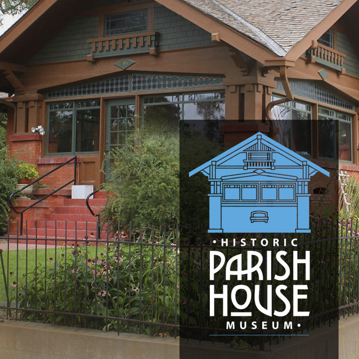
Some time back, my friend Karla Humphrey told me about her experience volunteering for a small town historical society and museum in Johnstown, Colorado. The museum, located down the street in her neighborhood, occupies a striking Arts and Crafts bungalow built in 1914 by town founders Harvey and Mary Parish—it is known as the “Parish House”.
We discussed, offhandedly, some of the things the organization might do to increase interest in the museum and the town.
As all designers and marketers know, this is where we get into trouble—someone tells us something about a worthy cause that needs doing and that looks like an interesting challenge. No, lights did not flash and the alarm did not whoop, whoop, whoop. The result, instead, is that I became a volunteer for a small town historical society and museum in Johnstown, Colorado.
Below, just for fun, is what we came up with…
A logo design
What we thought they needed, first and foremost, was a new identity. With new clients I often find this to be the case—they come to me with a marketing want/need and I end up telling them they need a new logo. Not, necessarily, because I want to sell a logo design, but because what they currently have isn’t substancial enough to carry the load of a new marketing program. In this case, the organization had a stationery design but not something that was designed to handle all the possible uses for a mark: print materials, signage, a website, social media posts, promotional items, and so on.
I tell clients a descriptive, distinctive name and logo is the foundation on which a brand is built. Without both, marketing an organization’s products, services, and ideas is significantly more costly and difficult because, every step of the way, you’re working around a deficit.
From the outset, I thought the imagery should incorporate the design of the house. I like logos that tell you something significant, at a glance, about a part of the story that makes that organization one-of-a-kind. The society’s Arts and Crafts era headquarters does that in at least two different ways.
First, the town was founded in 1902 during the heart of the Arts and Crafts movement—between roughly 1880 and 1920. H.J. Parish, seeing his land was ideally located adjacent to a new leg of the Great Western Railroad, submitted a plat for the town and named it for his youngest son, John. In other words, the architectural style of the house represents the heyday of the town’s founding.
Secondly, and more practically, playing on a historic period like this, provides an substantial stream of marketing opportunities—I imagine Arts and Crafts banners hanging in the downtown, Arts and Crafts-oriented exhibits and events, and other celebrations that play on its turn of the twentieth century founding.
The process
Karla provided some photographs of the building and I chose to focus on the gable end of the house. I knew even a simplification of the design would be visually complex, so minimizing the number of lines and angles was a requirement, the gable end is not as complex as the front and it screams Arts and Crafts.
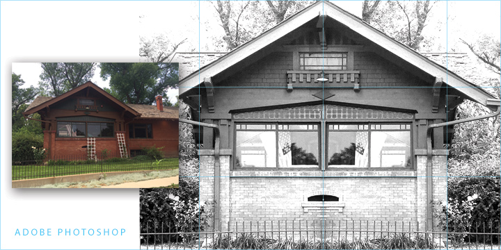
In Adobe Photoshop I used Image > Mode > Grayscale to convert the photograph to black and white then Image > Adjustments > Levels to brighten dark areas and increase the contrast. I used Edit > Tranform > Distort to correct the keystoning and to square the horizontal and vertical elements. I then sliced the image in half vertically, copied the left half, pasted it in place, and flipped it horizontally to produce two side-by-side sections in perfect symmetry.
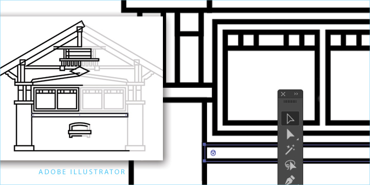
Next I placed the image on a locked layer in Adobe Illustrator and began drawing the shapes—I added and subtracted details and experimented with the elements to simplify and highlight various aspects of the design. After multiple tries, I ended up with the image you see here.
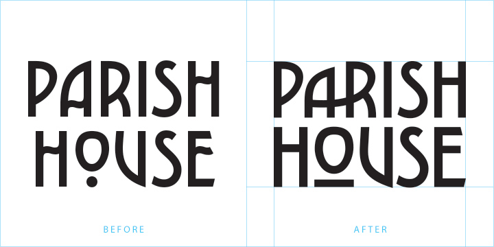
The typography was the fun part. I found an elegant typeface, Carilliantine, designed by British designer Rian Hughes. In its description, MyFonts says the face “updates the organic curves of Art Nouveau typefaces typified by John F. Cumming’s Desdemona, designed around 1886.” And that played right into the Arts and Crafts era design.
I made some significant changes to the characters and invented some characters and ligatures of my own to produce what my mind’s eye sees as a cohesive composition.
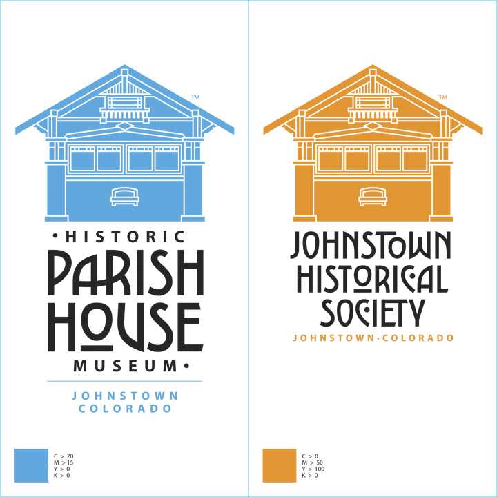
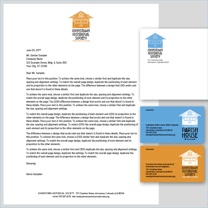
Once I had the Parish House logo where I wanted it, I created a version of the logo for the Johnstown Historical Society using the same symbol and typeface. The color choices, to me, give it a somewhat contemporary flair.
Next, I designed stationery and business cards…
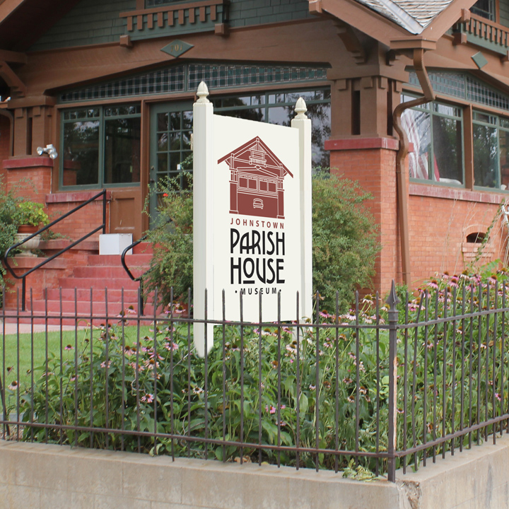
Mocked up some signage…
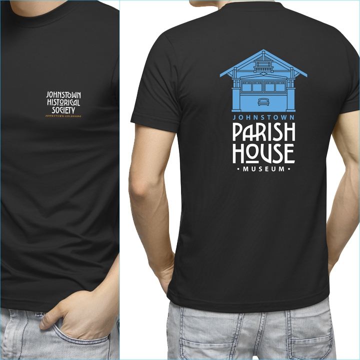
And, finally, presented how the new logos might be used on apparel.
If you’d like to get a feel for this part of the country, a while back my wife Leslie and I drove through the area just south of Johnstown on day 15 of our vacation…
“Nobody cares about your crumby vacation pictures…”
Posted in OCTOBER 2020 / Chuck Green is the principal of Logic Arts, a design and marketing firm, a contributor to numerous magazines and websites, and the author of books published by Random House, Peachpit Press, and Rockport Publishers. All rights reserved. Copyright 2007-2020 Chuck Green/Logic Arts Corporation. Contact.


Thoughts?