While we’re on the subject of drawing (recent post), let’s visit someone who has mastered it: Thomas Starnes Jr. (I’m guessing he’d tell you he’s still learning.)
Why would a designer learn to draw?
I got thinking about this when I asked Thomas, generally, why it’s important/useful to learn to draw. He told me, “For anyone seeking an art career, it’s indispensable. A quote attributed to Michelangelo reads ‘Drawing is the fountainhead and substance of art’. For anyone who wants to be a painter, illustrator, animator, etc., drawing is the foundational skill to learn. Students who draw well usually go on to paint well. Conversely, when a student says: ‘My paintings are good, but I struggle with drawing’, I immediately know that the student is unaware of the problems in their painting.”
So true. I told Starnes, from a designer’s standpoint, I think drawing gives you a deeper understanding of things—my drawing instruction in college, for example, forced me to pause, study, and evaluate what I was seeing in a way that became an integral part of the way I think. We all draw as children but learning to see shape, proportion, perspective, and such is something that would enrich anyone—especially a designer.
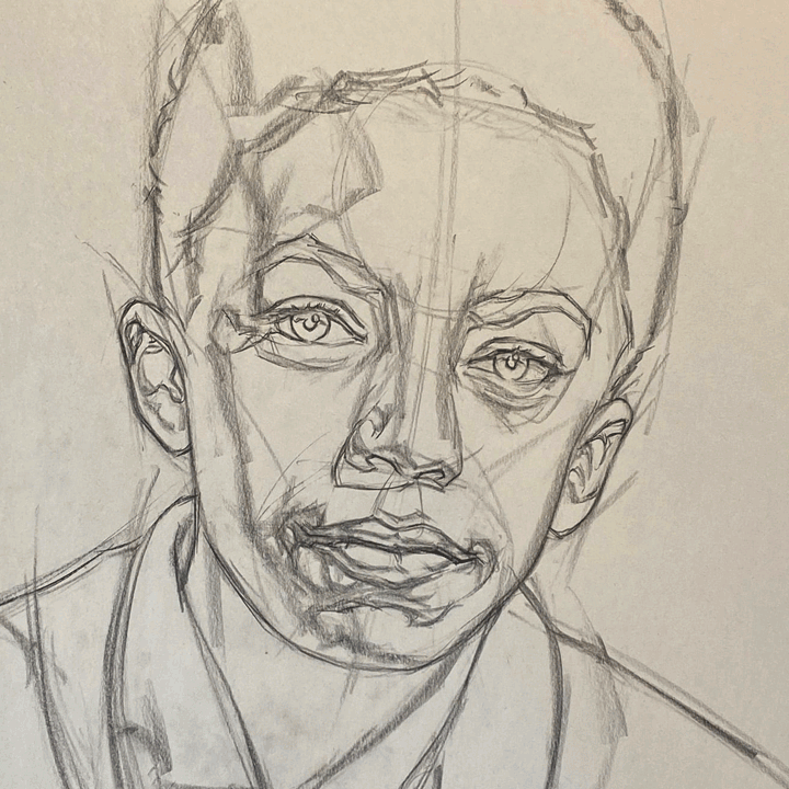
I’ve learned a few things studying Thomas’ work, perhaps you will too. Take, for example, this charcoal on newsprint portrait of actor Miles Brown.
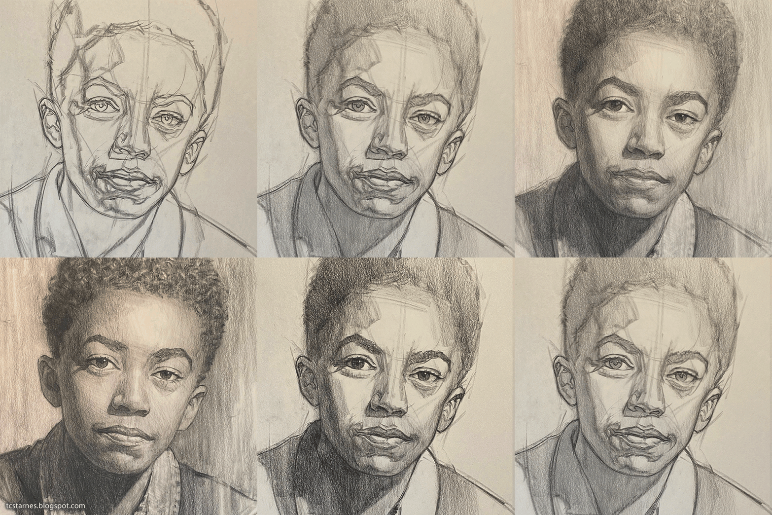
I found it instructive to see the framework on which he built it. I took the liberty of combining a few of his sketches with the finished product to show you the stages he went through to get to the final outcome. (When he posted it he claimed, “I feel some subtleties of the face are not quite achieved.” Haha… I drew for years and didn’t even get close to his level of expertise.)
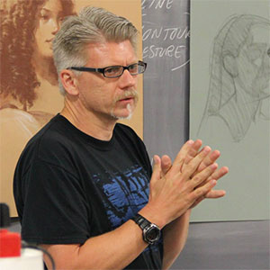 Starnes, I found, is a jack of all trades: an animation artist, an illustrator, a fine artist, a teacher, and, to me, a technician. He’s been an illustrator and animation artist on feature films for Disney, Dreamworks, Universal Studios, and others, has taught hundreds through classes and workshops, and has exhibited his drawing and painting through galleries and competitions across the country.
I call him a technician because, to do what he does, you must have a clear understanding of (not only) the broader areas of composition and storytelling, you’ve got to understand the media (paint/pencil/digital and so on), the nuance of composition, and the science of perspective—not to mention, in some instances, the complexities of motion picture production and working with large teams of other creatives (which, to me, might be the toughest challenge of all).
To that end, I don’t know if folks fully appreciate the number of people and the effort it takes to create a full-length animated film. I asked Thomas how, for example, his layout work was used in the Dreamworks 2002 feature Spirit: Stallion of the Cimarron. (Looking at the IMDB, I count roughly 700 people are included in the movie’s credits with roughly 350 designated as the Animation Department. Starnes’ (T.C. Starnes Jr.) credit is for “Layout Artist.”) (His full IMDB profile is here.)
Here, for example, is Thomas’ layout and one of the scenes from the film in which it appears…
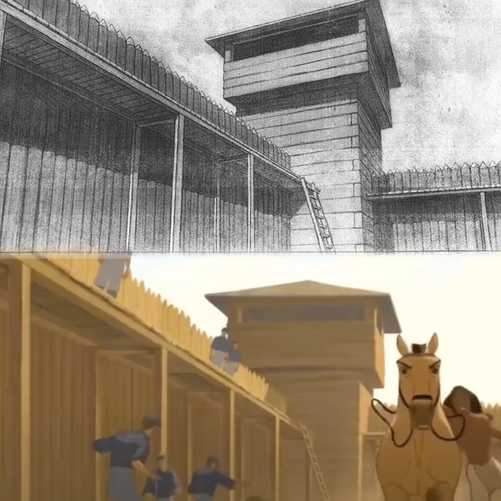
Thomas told me, “This sequence was done by a team of artists, so I did not do every background of the fort. The final layout you show was done by another layout artist, and the background painting was done by yet another artist in the background department.”
“In feature animated film (at least as it was being done by Disney and Dreamworks at this time), a scene would go through many stages, most notably:
The Storyboard: A basic visual outline.
The Workbook: A more detailed storyboard, complete with planned out camera moves.
The Layout: The actual production background at full size with rough character drawings to suggest how characters will move through the scene.
After that, the scene goes to animation, where the character and effects animation is added (the drawings are still rough at this stage).
If the scene gets approved, it generally comes back to layout for any revisions to the background, while the character animation drawings go to the animation cleanup department for final line work. Back in the layout department, we would create a full tonal rendering of the background, which establishes the lighting and atmosphere.
If that rendered version gets approved, it goes to the background painting department. Eventually, all the parts (final background, character and effects drawings) go to compositing, where all the parts are assembled to make the film.
We did everything in black and white first, so the directors and producers could see how the film was progressing and could decide what changes to make before committing the time and energy to go full color.
Not all animation studios work this way (especially the smaller studios with limited budgets), but the big studios with the time and money, had the luxury of doing the full tonal renderings for the layout stage. That gives the illustrator the opportunity to really explore lighting and atmosphere in ways that would not be possible otherwise. On lower budget productions where there is no time for full tonal rendered layouts, a background may go straight from line drawing to full color painting.
For the background below, I did both the tonal layout (top) and the final painting (bottom).”
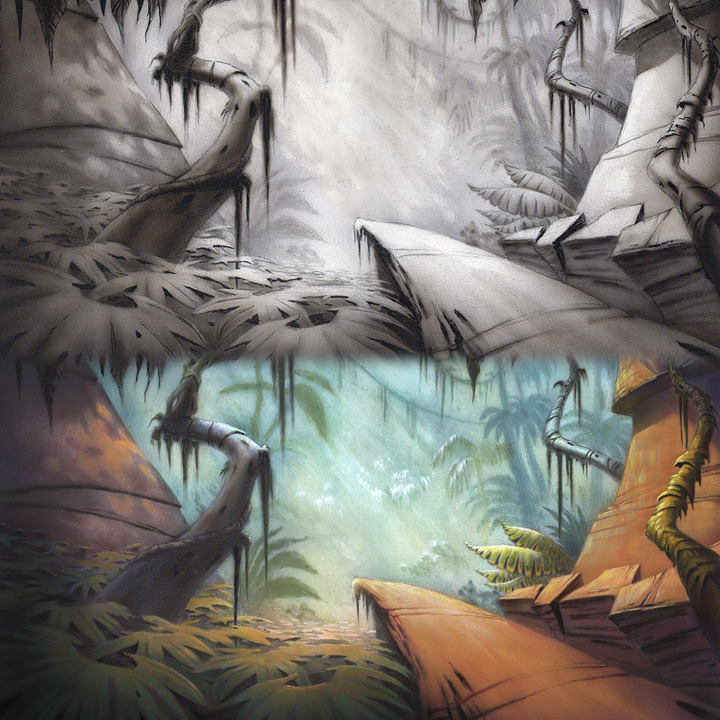
“This is most fun for me, since I get to create the scene from conception to final version. I have had other background painters tell me they enjoy working from my tonal layouts, since I work out all the lighting issues pretty thoroughly. This approach hearkens back to the Renaissance method of painting a full tonal version in gray or green paint (grisaille or verdaccio), and then painting over it in full color. Since all the lighting issues are already resolved, you can relax and enjoy the process.”
The actual sequence:
And a short about the making of the movie:
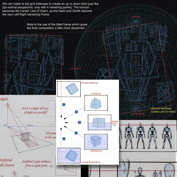
In recent years, Starnes has devoted much of his time to teaching. His website features some of the materials he uses to illustrate his lectures such as these graphics regarding perspective.
I urge you to encourage budding designers to master the art of drawing—it might even alter their career path. Point them to Thomas Starnes’ website and portfolio—he’s one of those folks who is willing to share his considerable talents.
How about you? Did you learn to draw? Did it play an important role in your career?
Posted in SEPTEMBER 2020 / Chuck Green is the principal of Logic Arts, a design and marketing firm, a contributor to numerous magazines and websites, and the author of books published by Random House, Peachpit Press, and Rockport Publishers. All rights reserved. Copyright 2007-2020 Chuck Green/Logic Arts Corporation. Contact.


Thoughts?