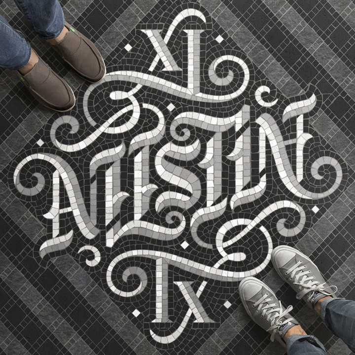
Every designer strives for work that looks natural. By that I mean, when a design works, it looks as though it is almost organic—the composition optimizes the space, elements fit like puzzle pieces, and the effect is instantaneous.
Nick Misani’s stuff, to me, looks like that kind of natural. No surprise he is a Senior Designer at one of the top graphic design studios on the planet—Louise Fili Ltd. In addition to her own stellar talents, Fili knows how to hire—her proteges also include, among others, Jessica Hische, Kelly Thorn, John Passafiume, and Dana Tanamachi.
But the pieces that knocked my socks off are Misani’s faux mosaics illustrations. They look real don’t they? They’re not. He calls them “fauxsaics” and they start out as Illustrator files and are colored, aged, and lit in Photoshop—6,000 to 10,000 tiles each.
Check them out but don’t miss Nick’s other work. His eye for typographic composition is second to none.
An interview with the designer from the ADC…
A site featuring Misani’s faux mosaics…
He is a Senior Designer for the Louise Fili graphic design studio…
Thanks to Jessica Jones for pointing us to it.
The illustration above—an ambigram of Austin, Texas—is a collaboration between Nick Misani and Mark Caneso.
Posted in July 2017 / Chuck Green is the principal of Logic Arts, a design and marketing firm, a contributor to numerous magazines and websites, and the author of books published by Random House, Peachpit Press, and Rockport Publishers. He resides in Glen Allen, Virginia. Contact.


Thoughts?