I have always enjoyed repurposing stock photography and graphics. (Wonder what ever happened to the term, “clip art?” Bet I haven’t heard those words strung together in five years.)
In any case, I’m talking about taking various bits and pieces and inventing something new from them. This is a recent example I created for Click2Mail.com, a company that produces on demand postal mail.
The assignment was to create a tradeshow display illustration that would communicate the nature of the company’s product and grab some attention in that hectic type of environment. So the subject is postal mail in the form of letters, postcards, brochures, etc., the United States Postal Service, cost savings, and so on.
These are the elements I licensed from Adobe Stock to work with…
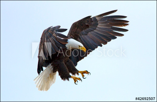
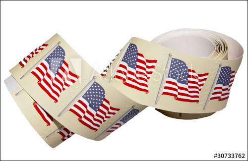



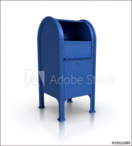
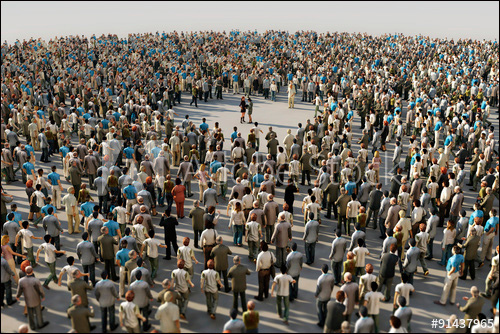
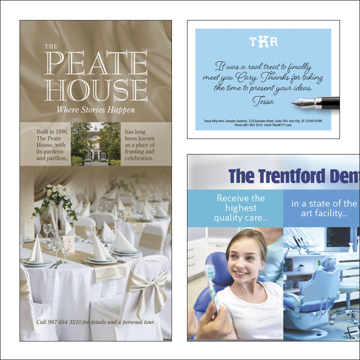
The faux postcards and letters were samples I created using other stock images…
And here’s result. A 7 1/2 by 10 foot curved, pop-up display. (ShowstopperExhibits.com are the folks who coordinated the production.)
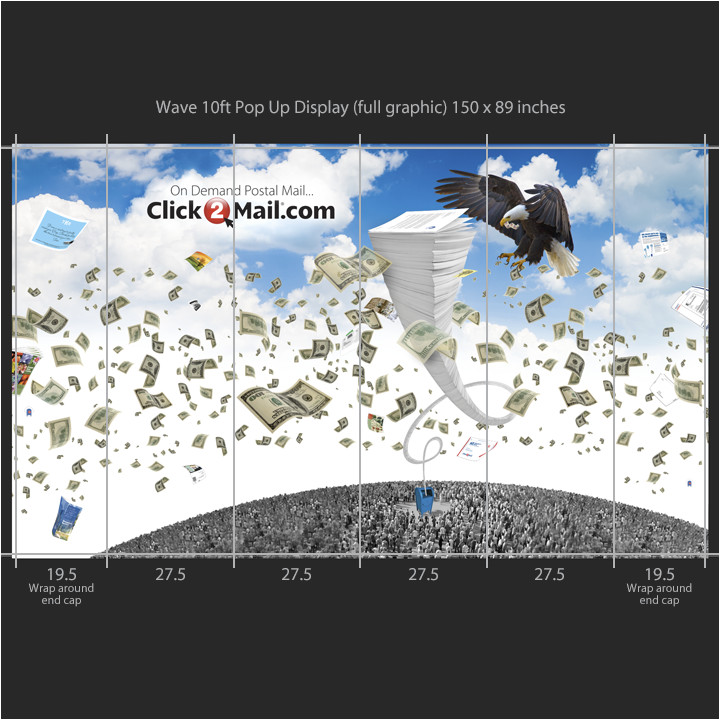
A few closeups: I used Photoshop’s Warp feature to curl the mailpieces…

Cutting and pasting parts of images in front of and behind others adds a sense of depth and realism…

I converted the 3D illustration of the crowd to grayscale then cloned pieces of it to create the large base image. And, just for grins, I added a curved piece metal seam on the front of the mailbox to make it “smile”…

Finally, I hung a strand of postage stamps from the eagle’s beak…

I like to use a very slight application of the Photoshop “Paint Daubs” filter to equalize the level of detail among the images. It somewhat overcomes the fact that even large stock images are not necessarily meant to be used at such a large size.
Posted in APRIL 2017 / Chuck Green is the principal of Logic Arts, a design and marketing firm, a contributor to numerous magazines and websites, and the author of books published by Random House, Peachpit Press, and Rockport Publishers. He resides in Glen Allen, Virginia. Contact.




Thoughts?