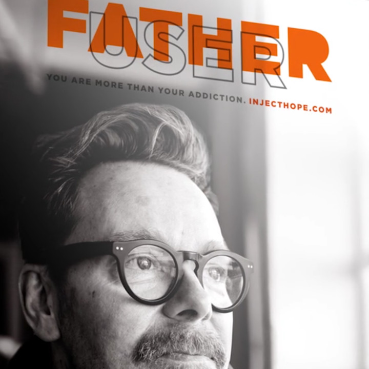
While researching a recent post about branding consultants Landor, I stumbled upon this thoughtful campaign for Inject Hope. I don’t for a second want to diminish the specific purpose of the work or divert attention from the quality of the idea. But I want to be sure you add the idea of superimposing headlines to your repertoire.
Honestly, I don’t recall seeing the idea used before. They superimpose one word, “user” over “father” (above) or “hope” over “dope” (below) to demonstrate the stark differences between the two perceptions.

I’m certain there are lots of ways creatives could use the same idea in other ways. Superimposing words or perhaps even superimposing images or illustrations in a similar way.
If, by chance, you’re not familiar with the term “swipe file,” it’s a repository of design and copywriting ideas that can be used in situations other than those for which they where originally intended. I keep mine in a big box next to my desk. Over the years I’ve filled it with printed pieces that contain some element—a concept, an illustration, a headline, a layout, or some such—that might form the basis of a new idea. Don’t misunderstand, it’s not about reusing the same idea or words, it’s about using the idea as a jumping off point for something new.
Posted in APRIL 2017 / Chuck Green is the principal of Logic Arts, a design and marketing firm, a contributor to numerous magazines and websites, and the author of books published by Random House, Peachpit Press, and Rockport Publishers. He resides in Glen Allen, Virginia. Contact.


Thoughts?