In The Poetics of Music, Igor Stravinsky says, “…In art as in everything else, one can build only upon a resisting foundation: whatever constantly gives way to pressure, constantly renders movement impossible. My freedom thus consists in my moving about within the narrow frame that I have assigned myself for each one of my undertakings.”
Houses and well designed pages have something fundamental in common: They are both built on a framework—a carefully measured, solid structure that forms a foundation on which to build.
A grid is a combination of non-printing margins, columns, and guides used as the underlying framework of a page. Though any type of document can incorporate a grid, it is long, detailed documents such as magazines, newsletters, newspapers, and books that virtually require them.
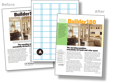 Though the grid used to create a particular page may take some detective work to discover, you can spot a grid-less document from a mile away (figure 1)—images and text float on the page in a seemingly random arrangement and elements repeated on multiple pages often appear close-to, but not in exactly the same position. Grid-less is fine if that randomness is intentional, it’s not fine if its simply a lack of planning.
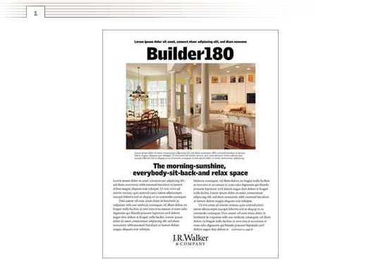
In contrast, a layout built on a grid looks far more organized (figure 2). See how the title, photograph, headline, and text all line up on the same vertical line below? The underlying grid adds a real sense of structure to the page.
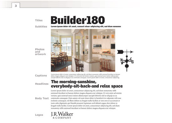
The thing that makes a grid different than simple columns is that you often span more than one column of a grid. On the page below, for example, though the text on the left spans one column, the title and photograph span four columns and the body text spans two. The distinction is that all the elements are aligned to the grid.
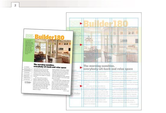
To incorporate a grid into your next page layout, start by identifying the elements you plan to use (figure 3) throughout your design. Below, just one page includes no less than eight types of elements: titles, subtitles, photographs, artwork, captions, headlines, body text, and a logo. A long document could easily include ten times as many elements.
 With the pieces defined, you can begin to experiment with different grids (figure 4). It takes only a few keystrokes to change from five columns to eight, to shrink and grow margins, and to experiment with different font and image shapes and sizes.
A page designed on a five-column grid will look a good deal different than one designed on a six-column grid. As you experiment with different structures, you are sure to discover lots of possibilities.
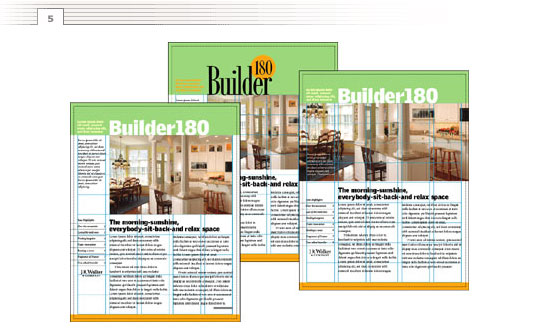
 Though I consider the grid part of the design, I think it is best described as a kind of visual discipline. And, while some consider a grid restrictive, I think of it as liberating. It frees me to spend my time experimenting with the more obvious elements of design—the shapes, colors, images, and typefaces that communicate the message (figure 5).
 Need more versatility? Add more columns to the grid (figure 6). Though I prefer the tighter structure of fewer columns, you might want to add more columns so you have a greater choice of where and how to line up the elements.
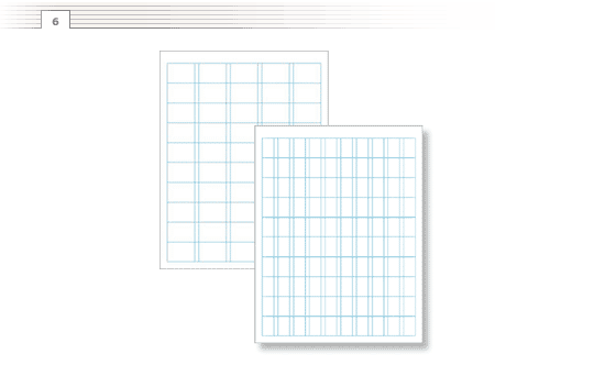 Once you’ve found a combination that works, set it up in your publishing or word processing program–just about all of them have non-printing margins, columns, and guides for just this purpose.
Whether you’re a seasoned veteran or just getting started, any designer can profit from analyzing the substructure of the designs they admire. With a little detective work, you can approximate the design of the grid for just about any page and apply the same or a similar structure to organize and present your own information. In fact, you may find that what you admire most about someone else’s work is something that is, in large part, invisible.
If you want more details, lots of great examples, and a little about the history of grids, I recommend The grid: a modular system for the design and production of newspapers, magazines, and books by Allen Hurlburt (John Wiley & Sons, ISBN 047128923X).
Thanks to Jeff Keith for pointing to the passage from The Poetics of Music by Igor Stravinsky.


Thoughts?