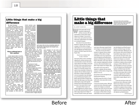
The truth is there is no secret design formula known only to professional designers. Readability is accomplished through a series of small, often subtle tweaks that anyone—designer or non-designer—can make.
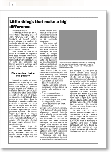
To illustrate my point, here’s a worst case scenario (figure 1)—a page that exemplifies some of the most common layout problems. In the next few minutes I’ll show you what I would do to improve it. It may seem like overkill, but I’m going to show you each significant change on a page of its own. That way, you can see just how subtle such changes can be. Want to test your observational skills? On the first go-round, scroll through without reading my explanations to see if you can determine what changes were made from page to page.
The first problem is the most significant—the flaws in the foundation on which the page is built.
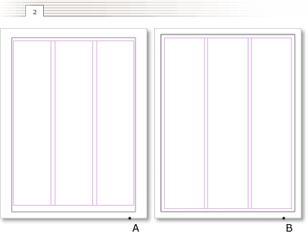
Illustration 2A shows the grid on which the example is built. To better use the space I’ll reconfigure the margins and the line surrounding the text (the “rule”) to be equidistant to the edges of the page (2B). This does two things: first, it gives me a bit more space to work with and, second, it adds some very important breathing room between the right and left sides of the text and the rule.
See how wide the space between columns is above (figure 1). I don’t recall having ever seen a successful design where the space between columns is wider than the space between the text and the outside rule. It just doesn’t work.
Voilá. Here are the same elements on the new foundation (fig. 3).
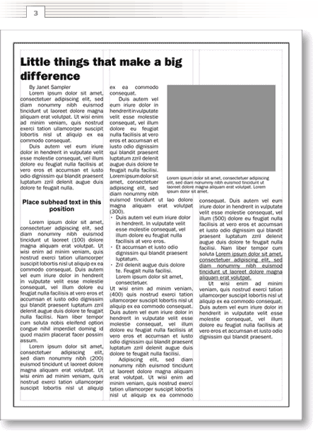
Next, I’ll stretch the photograph placeholder across two full columns and reposition the caption above it (figure 4). Reducing the number of vertical start points simplifies the look of the page. Even with the dramatic increase in the photo’s size, the page still accommodates the text.
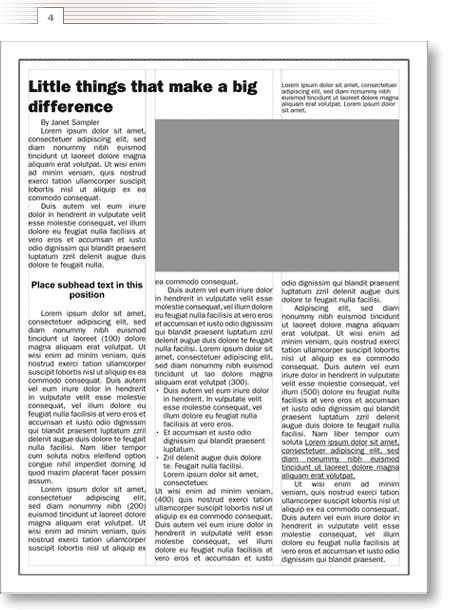
Personally, I prefer text that is flush left instead of justified—that’s the change in figure 5. Justification adds and subtracts the space between words to fill the column side to side. That results in gaps that, to me, slightly impede the reading flow. On top of that, I think the “squared-off” nature of justified text draws unnecessary attention to it.
Note the difference in the length of the text—flush left generally requires a bit more space.
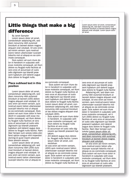
When I need more space, I sometimes substitute a more condensed typeface (figure 6). In this case, I’ll change from ITC Franklin Gothic Book 11/12pt to ITC Franklin Gothic Book Condensed 11/12pt and save roughly 2.75 inches of column space. More space equals more options.
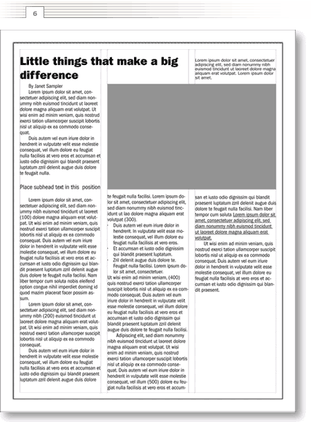
Now let’s focus on the headline (figure 7). First, let’s break it so the lines are closer to the same length. Generally, my first priority is to break headlines so they best fill the space and my second priority is to break them so they match the reading cadence. For example, all other things being equal, I’d break a headline like this in the following way:
Leave them wondering
how you got so good, so fast.
Which reads better than:
Leave them wondering how
you got so good, so fast.
In this case I’ll break the headline to fit the space.
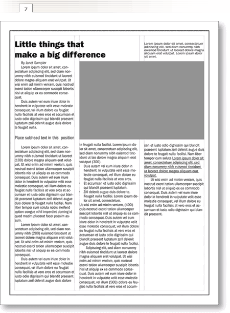
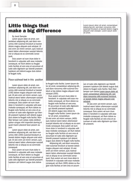
Next let’s tighten the headline’s leading (the space between lines of text) (figure 7). Originally it was set using the default “auto” setting—that generally adds a couple of points of space to the point size of the type. In this case the headline is ITC Franklin Gothic Heavy 24/28.8pt (this means the point size of the type is 24 and the leading between lines is 28.8). For headlines my preference is typically to set them “solid.” Solid describes text that has the same leading as the point size of the type—here that would translate to 24/24pt.
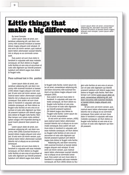
But I want even greater contrast between the headline and the text. So I’ll change it to a bolder, more interesting typeface, and size it to better fit the space (figure 8). I’m using Giza Seven-Three set to 37/34pt. Yes, the leading is even tighter than solid—a negative value. The big, bold headline leaves little doubt where I want my reader focusing.
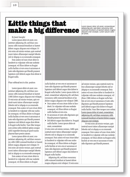
To complement the headline, I’ll change the text font to ITC Garamond Light Condensed (figure 10). I’m also going to increase the size of the text from 11/12pt to 12/14pt. Note that increasing it only slightly affects the length of the text.
Next, the most subtle of changes. I’ll make the lines of text following the headlines and subheads flush left (figure 11)—”un-indent” them. Why? Assuming we agree that indents are used to show the distinction between paragraphs, there is no need for that type of visual signal following a headline or subhead. Check out a magazine or newspaper—most follow this rule.
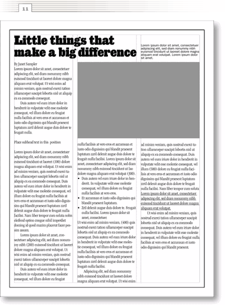
Sitting back and looking at the page as a whole (figure 11), I think the text is uncomfortably dense. To add some breathing room I’ll add another point of leading (figure 12)—from 12/14pt to 12/15pt. Don’t worry about the overrun, I’ll tweak the spacing in the final stage.
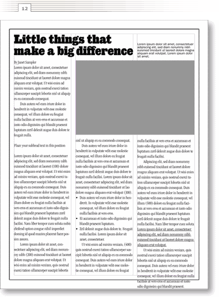
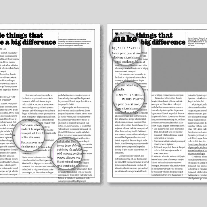
To set the author’s name and the subhead off from the rest of the text let’s make them all caps (figure 13). The stock solution is to set subheads in a bold version of the text face but I think, in this case, it would draw too much attention to them. To add a little more visual interest, I’m changing “By Janet Sampler” to “by” with a lower case “b” and adding extra space between the capitalized letters of “JANET SAMPLER.” Little things that make a big difference.
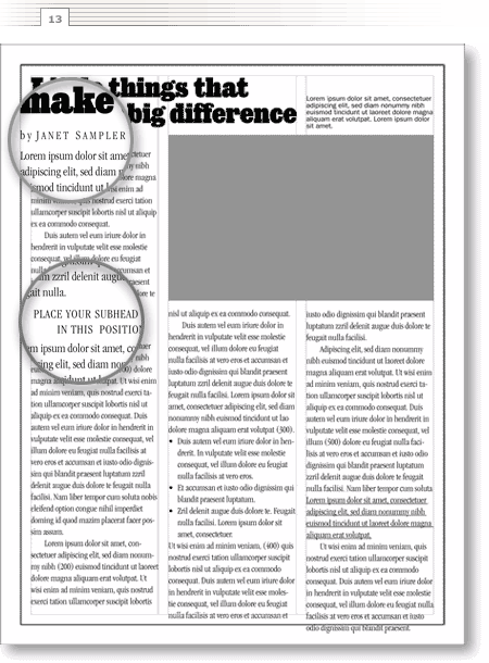
Now I’ll delete the bullets and underlines (figure 14). Yes, I know business writers love bullets and underlines but I, in most cases, do not. Both are ways of adding emphasis but there is a fine line between emphasis and chaos. There are many ways to add emphasis: headlines, subheads, spacing, boldness, italics, capitalization—and bullets and underlines. In this case, because I am using all of the above, I’ve got to get rid of something. When everything is emphasized nothing is emphasized.
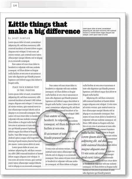
With those primary changes, I’m ready to adjust the depth of the photograph to accommodate those few lines of text hanging at the bottom of column three. I’ll adjust the bottom of the columns to line up and add a “continued on page?” at the bottom right to accommodate another page of text (figure 15).
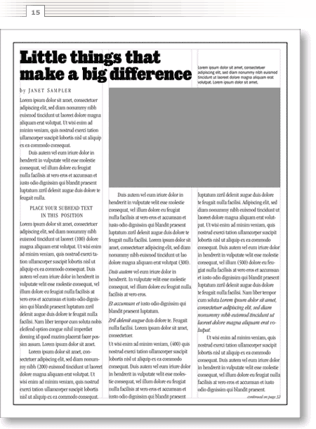
There, that solves the major problems. Now is when the fun begins—adding some finishing touches (figure 16). I’ll place ruled lines above and below the byline and add a drop cap at the beginning of the first paragraph.
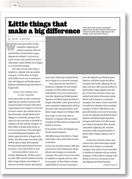
And here’s the page without the grid lines (figure 17). I find it helpful to turn off or hide the guides periodically because they add a certain organization to a layout that may disappear when you remove them.
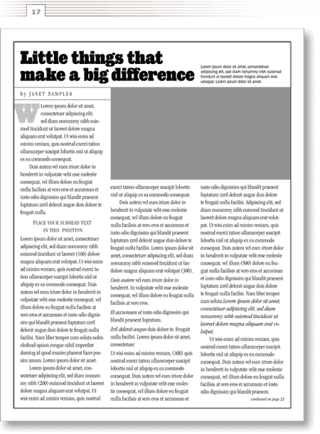
Follow the process of making gradual changes and small decisions and the changes seem inconsequential. Contrast the first and last pages (figure 18) and you see that little things make a dramatic difference.
