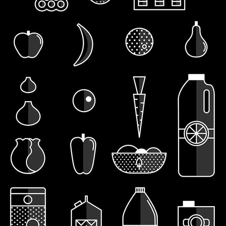
Turn off the audio of these videos and tell me if you can figure out what the message is. That’s the mark of design excellence isn’t it? That the key ideas are communicated on all different levels—seeing, hearing, and reading?
Designer and illustrator Lisa Odette shows how it’s done through these motion graphics she created for the British appliance manufacturer GDHA.”These simple and fun videos,” she says, “Are meant to show an efficient and correct way to store different foods in the fridge.” There are two different videos, each for a different GDHA brand.
What drew my attention to them was their lyrical simplicity. I wouldn’t dream of trying to even estimate the number of times a designer has created a set of food icons, but these are distinctive. The simple but effective technique of adding a vertical line between the values of the two sides works well to add some interest and the sense of a gloss finish.
I’m guessing most designers hope their work will communicate useful information and do some good. This, to me, achieves both.
Here are the individual groupings…
In black and white for the Stoves brand…
And in color for the Bolling brand…


Thoughts?