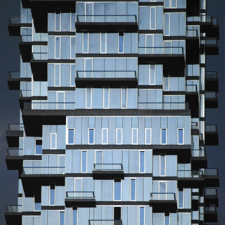
Does the new 56 Leonard tower in Tribeca feel like graphic design to you? I haven’t quite put my finger on it but there’s something about it that drew my eye to it the first time I saw it.
Maybe it’s the shapes that are slightly reminiscent of hot metal slugs. Or perhaps it’s just the cadence of evenly spaced windows on randomly stacked floors as if they are rows of type.
In any case, there’s something about it that whispers graphic design to me—and I love it.
The architect is Herzog & de Meuron…
Thanks to Carlos Restrepo for allowing me to use his handsome photograph (top).


I read on their website that from the 145 apartments, only 5 of the are identical. That is pretty impressive. From the available renderings I think it will be a mixed building, residential and business.