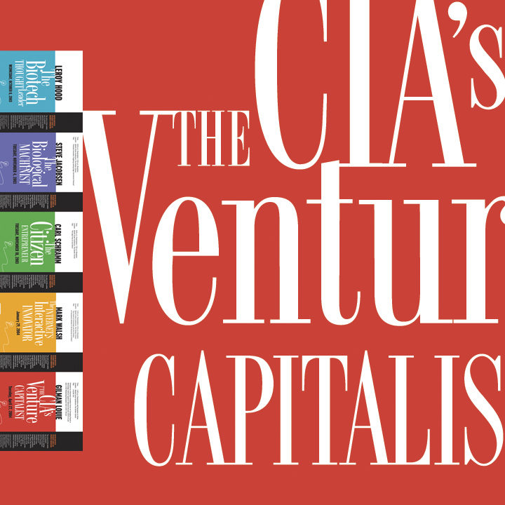
The Word Works Palette uses vivid colors and the beauty of elegant typefaces to do the job typically delegated to illustrations and photographs. And it is economical.
I grew up in a home where frugality was considered an art form. It stuck, and all these years later I still see those who are intelligent about how they spend their resources as having a significant advantage—efficiency allows you to do more for others and yourself.
What is a design palette?
My job as a designer is not only to come up with a sound approach to marketing, but also to do it with respect for my client’s resources. I may not always create the most cost-efficient solution, but the principle certainly ranks high on my list of goals. I created this particular palette some time back but I think the thinking, if not the design itself, stands up pretty well.
The Layout
Black on white, bold versus light, large stretches of solid color side by side—what makes this palette work is the principle of contrast.
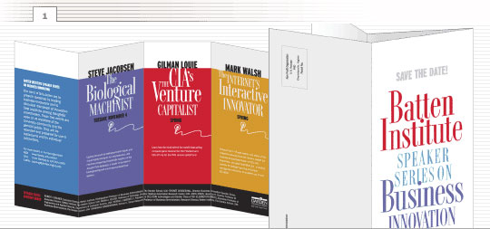
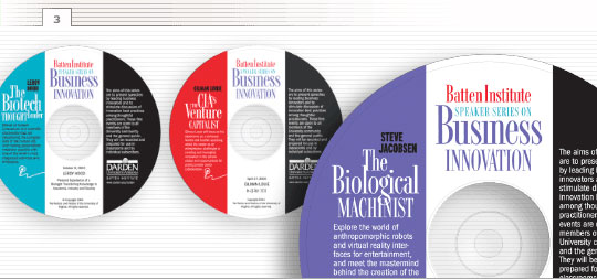
The project the palette was developed to address includes three components: a brochure describing a series of presentations (figure 1), a poster for each event (figure 2), and CD-ROM labels for distributing copies of the presentations after the fact (figure 3).
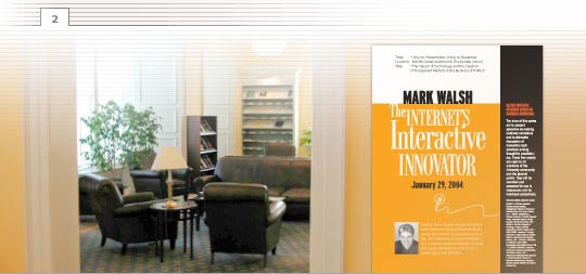
The bold black stripe across the bottom of the brochure and up the side of the poster and the label has two distinct purposes—aesthetic and functional. Aesthetically, on the brochure, it provides a visual foundation that helps link the colors together. And on the poster and label, it acts as a counterweight to the large areas of solid color. Functionally, the black space serves as a way to organize the information by providing a separate space for general information about the series.
The visual anchor for every piece is the title and what makes it eye-catching is its arrangement (figure 4). The object is to size the elements in order of their significance. “THE” is reduced, “CIA’s Venture” is blown up. “CAPITALIST” is smaller than “CIA’s Venture” but it is set in all caps for emphasis.
Once you size the words in order of their importance, you fit them together like puzzle pieces filling the natural gaps created by each individual shape.
The ideal tool for doing this a drawing program such as Adobe Illustrator or CorelDRAW. You convert the type to outlines then scale and arrange the words as you would any other type of drawing object.
The Typefaces
The elegant, condensed typeface used for the program titles is Racer (figure 4). It is difficult to find these days, but there are many typefaces that easily pull the same duty: Fashion Didot from BA Graphics is a close match or you could experiment with a different look and feel using a typeface such as OL Marla Bold, one of many elegant typefaces designed by Dennis Ortiz-Lopez.
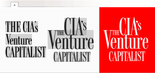
Pay careful attention to the spacing between letters (figure 4). Racer is an example of a font that does not lend itself well to the type of automatic kerning (letter spacing) the computer is so good at. With a type-intensive layout like this, you’ll need to fine-tune the spacing between individual letters. Above, the difference is demonstrated between text as it is typed out (left) and how the final type is spaced (center).
The names of the presenters are set in a typeface that offers a powerful contrast to Racer—Interstate Black Compressed (figure 5). Imagine how different the palette would be without it. It offers a counterpoint that makes the elegant title much more distinctive.
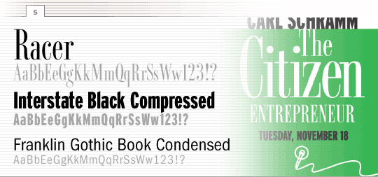
The body text is set in ITC Franklin Gothic Book Condensed—a crisp, clean sans serif face that John McWade, editor of Before & After Magazine, introduced me to a 20 years ago. It has personality, but not so much so that it gets in the way, and because it is condensed, it allows you to fit more information in less space.
WHERE TO GET IT:
Fashion Didot from BA Graphics at Myfonts.com…
OL Marla Bold from Dennis Ortiz-Lopez at Myfonts.com…
Interstate Black Compressed from Font Bureau at TypeNetwork.com…
ITC Franklin Gothic Book Condensed from International Typeface Corporation (ITC) at Myfonts.com…
The Colors
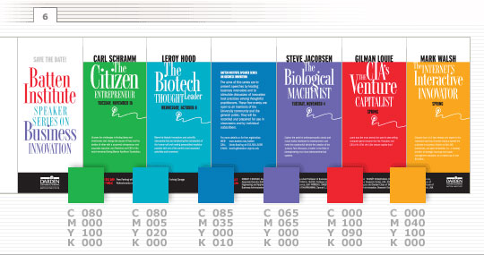
Color plays a major role in this palette. To me, such a wide spectrum emphasizes the diversity of subject matter and contributes significantly to the actual organization of the information.
For this project, each event is assigned a different color and that same color is used as the primary color of the accompanying poster and CD-ROM label. The illustration (figure 6) shows the color assigned to each of five events and the CMYK percentages used to create the colors.
The Illustrations
The simplicity of the sole illustration—a line drawing of a microphone—adheres to the old saw that “less is more.” A photograph of a past presentation or an elaborate piece of artwork could just as easily have been used, but the uncomplicated drawing intentionally keeps the focus on the title.

Why This Solution?
An all-type or mostly-type layout and palette like this is an obvious choice when, one: there are few or no images or illustrations available. Two: when you intend to use the results at extreme sizes—in this case, large for the posters to small for the labels. Or three, when you have a particularly tight budget.
This is one in a series of design palettes: the mix of basic ingredients—typefaces, photographs, illustrations, and color schemes—that, in one designer’s opinion (mine), represents a distinctive mood or style.
Posted in JUNE 2021 / Chuck Green is the principal of Logic Arts, a design and marketing firm, a contributor to numerous magazines and websites, and the author of books published by Random House, Peachpit Press, and Rockport Publishers. All rights reserved. Copyright 2007-2021 Chuck Green/Logic Arts Corporation. Contact.
