 Lettering designer Michael Clark and I began our careers in the same town around the same time—Richmond, Virginia, me in the mid 1970s, him in the early 1980s. We only worked together a couple of times but we traveled the same circles and have been friends all these years.
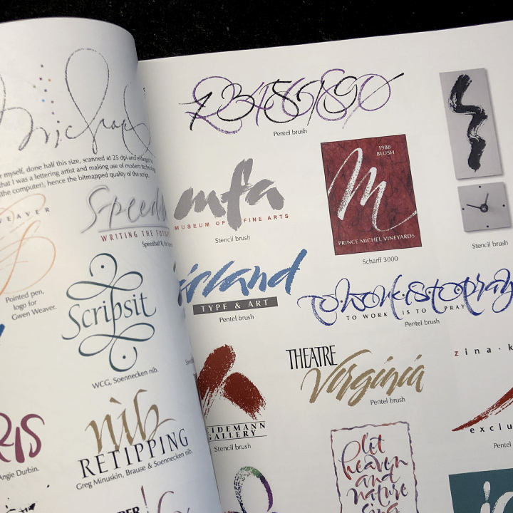
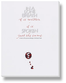
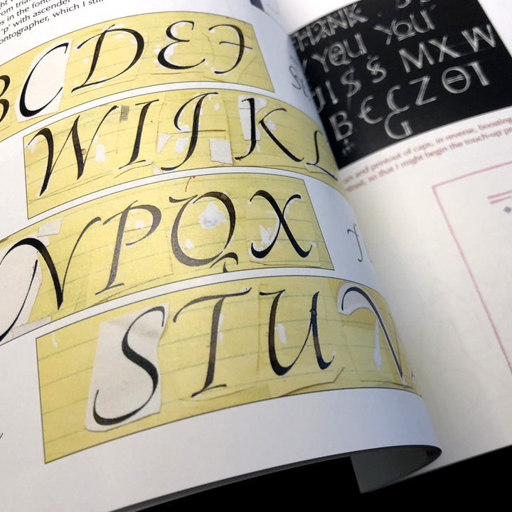
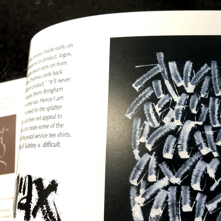
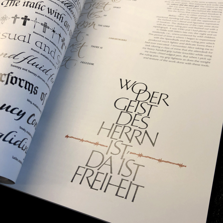
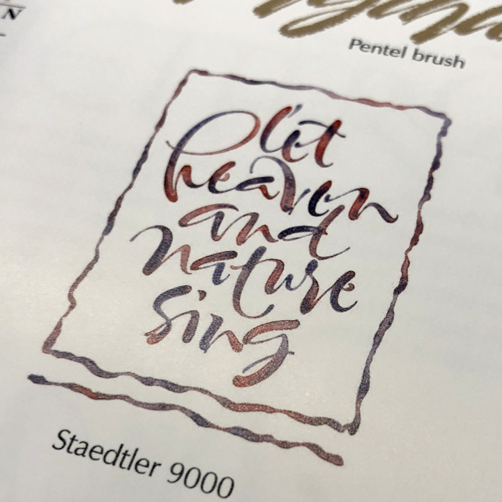
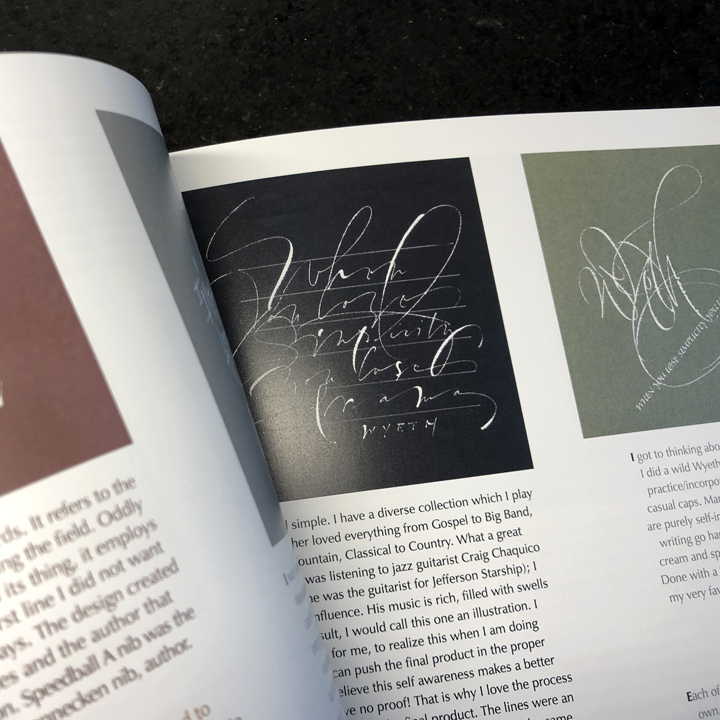
I’ve pointed you to his work several times in the past but I’m going to do it again on the occasion of his recent book In a Lone Breath it is Written—It is Spoken Just the Same—a 72-page compilation of Michael’s work interspersed with insights into his inspiration, design sense, and process. I’ve sampled a few of the pages below.
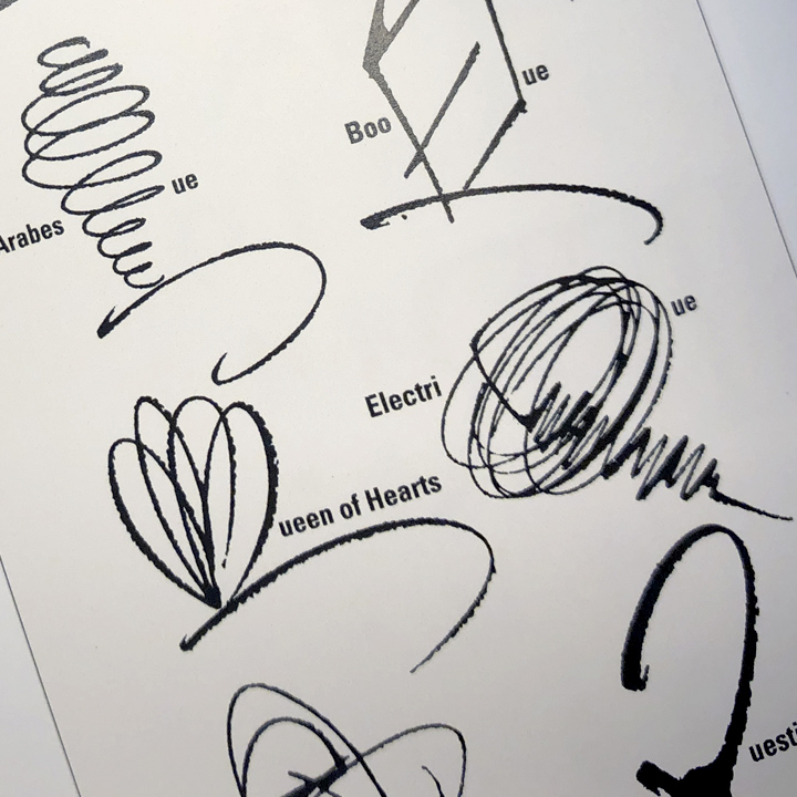
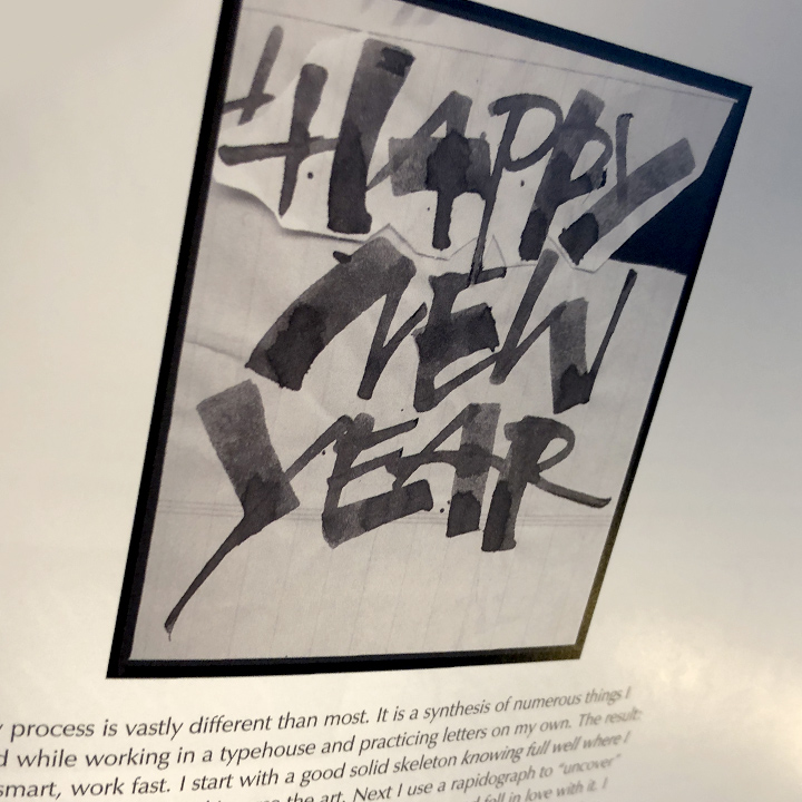
As Michael will tell you, he’s a lettering artist first and a calligrapher second—though he clearly loves freeform, un-retouched calligraphy, his real talent is in creating roughs or “skeletons” of letters and then in perfecting them through craft and finishing.
And though he credits many who have influenced him, he is passionate about remaining autonomous. There were times, he’s told me, that he even avoided studying the work of a particular artist because he did not want to be accused of copying their style. The proof of that is how unique is his work is—different tools, different mind, different outcome.
That said, he does have a list of those he admires: among them Rick Cusick, Michael Podesta, Herb Lubalin for their design, Sherry Bringham, Fritz Poppl, and Werner Schneider for their calligraphy, and Hermann Zapf, Jose Mendoza y Almeida, and Gerard Huerta for their lettering design.
Using non-traditional tools in a traditional craft
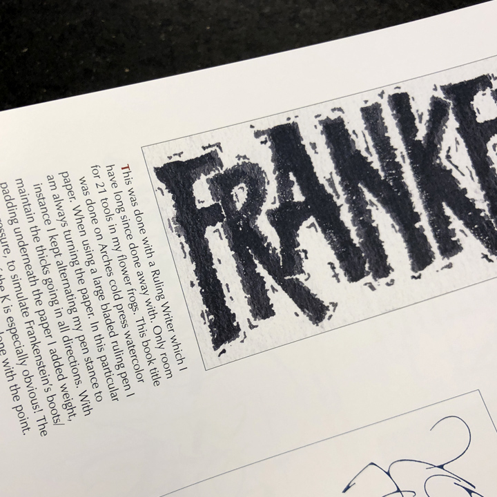
In a recent meeting, we compared our experience with ruling pens—for the uninitiated, a ruling pen is a device that traps ink in a slot between two flexible metal jaws that you can taper to produce various line widths.
In prehistoric times, I told him, I used a ruling pen for creating crop marks but traded it in for a Koh-I-Noor Rapidograph technical pen when I discovered them in the 1970s. Michael on the other hand, the consummate craftsman, still has his first and favorite ruling pen and, until his retirement, maintained it and a 4×0 Koh-I-Noor Rapidograph to perfect his lettering and for touch-up.
Later, he began experimenting with, and ultimately became an expert with, Speedball A and B nibs. In the book he refers to this nib and that, round and square, used to produce this and that effect. He developed such an expertise in contemporary forms using those tools that his work is included in the famous Speedball Textbook (now in it’s 24 Edition) and on the Speedball website.
Michael taught and lectured on his unique use of non-traditional tools in a traditional craft (ruling pens, stencil brushes, Speedball nibs, and so on) at calligraphic societies and universities around the world, from Australia and the Mariana Islands (where he established the typographic tone of a Chamoru culture magazine) to Sweden and the UK.
The work
Over the years Clark has worked with a long list of corporations, book publishers, advertising agencies, and type foundries to develop typefaces and calligraphic illustrations. His work is found in the form of typefaces designed for a specific use (proprietary), such as the those used by Colonial Williamsburg and Phillip Morris, as well as commercial typefaces available through various foundries, now mostly consolidated by P22.
You’ll also find his work on many retail shelves. Firms as diverse as Dole, Alka-Seltzer, Kraft, Motts, Mueller’s, and Home Depot are among the many that have used his commercial typefaces to brand and label everything from pasta to zip lock bags.
Michael also did a short stint at Hallmark where he caught the greeting card bug. So when I got an email from an order of Nuns looking for someone to design sympathy cards, I immediately thought of Michael Clark. It turned out to be a fortunate stroke of serendipity. He ended up working with the Sisters of St. Clare for two decades creating cards that, I am certain, touched many people in their times of need.
What more could you ask?
Book: In a Lone Breath it is Written…
Michael Clark’s Facebook page…
Some of his typefaces are available through MyFonts.com…
If you’d like to see much of the work he most admired, check out the journal he edited for the Washington Calligraphers Guild: Scripsit…
An introduction to Michael’s work and influence by fellow calligrapher Randall Hasson…
Posted in AUGUST 2019, Updated in FEBRUARY 2024 / Chuck Green is the principal of Logic Arts, a design and marketing firm, a contributor to numerous magazines and websites, and the author of books published by Random House, Peachpit Press, and Rockport Publishers. All rights reserved. Copyright 2007-2019 Chuck Green/Logic Arts Corporation. Contact.
