I don’t know if you’ve ever spent time looking at matchbook collections, but they can be more than just fun to look at.
Because the designer’s who design them have so little space to work with, they are forced to condense ideas to their essence. And that’s what a logo should do.
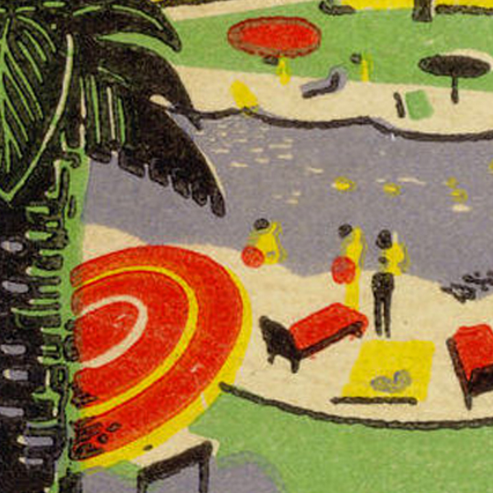
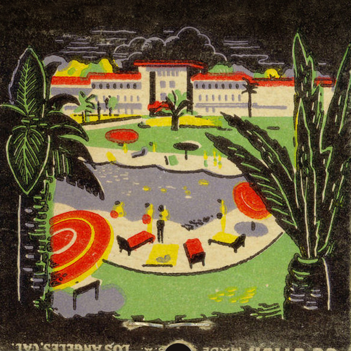
Take a look through a good collection and you’ll find all kinds of metaphors, icons, cliches’, signs, visual puns, and symbols that could be reimagined. Look deep. You’ll find illustrations, type treatments, simplistic layouts, color palettes, styles, and so on, all of which can jumpstart your design thinking.

For example:
An example (from Jane McDevitt’s collection)…
The full collection…
From WackyStuff…
From Collectorsweekly.com…
From Arnon Reisman…
From US matchbooks by Judy Cote…
Thanks to Darron Fick for sharing the Flamingo Hotel matchbook (above).
Posted in SEPTEMBER 2019 / Chuck Green is the principal of Logic Arts, a design and marketing firm, a contributor to numerous magazines and websites, and the author of books published by Random House, Peachpit Press, and Rockport Publishers. All rights reserved. Copyright 2007-2019 Chuck Green/Logic Arts Corporation. Contact.


Thoughts?